![]()
Introduction
The volcano3D package enables exploration of probes differentially expressed between three groups. Its main purpose is for the visualisation of differentially expressed genes in a three-dimensional volcano plot. These plots can be converted to interactive visualisations using plotly.
This vignette consists of a case study from the PEAC rheumatoid arthritis project (Pathobiology of Early Arthritis Cohort). The methodology has been published in Lewis, Myles J., et al. ‘Molecular portraits of early rheumatoid arthritis identify clinical and treatment response phenotypes.’ Cell reports 28.9 (2019): 2455-2470. (DOI: 10.1016/j.celrep.2019.07.091) with an interactive web tool available at https://peac.hpc.qmul.ac.uk.
There are also supplementary vignettes with further information on:
- Using the volcano3D package to perform 2x3-way analysis. In this type of analysis there is a binary factor such as drug response (responders vs non-responders) and a 2nd factor with 3 classes such as a trial with 3 drugs. See here.
- Using the volcano3D package to create and deploy a shiny app. See here.

Example 1. Synovial Gene Data
This vignette will demonstrate the power of this package using a basic example from the PEAC data set. Here we will focus on the synovial data from this cohort.
Using the synovial biopsies from PEAC we can create a polar object for differentially expressed genes. The sample data used in this vignette can be loaded from the volcano3Ddata package.
devtools::install_github("KatrionaGoldmann/volcano3Ddata")
library(volcano3Ddata)
data("syn_data")Samples in this cohort fall into three pathotype groups:
| Pathotype | Count |
|---|---|
| Fibroid | 16 |
| Lymphoid | 45 |
| Myeloid | 20 |
In this example we are interested in genes that are differentially expressed between each of these groups.
The differential expression can be mapped to polar coordinates using the polar_coords function, which has inputs:
| Variable | Details |
|---|---|
|
outcome (required) |
Vector containing three-level factor indicating which of the three classes each sample belongs to. |
|
data (required) |
A dataframe or matrix containing data to be compared between the three classes (e.g. gene expression data). Note that variables are in columns, so gene expression data will need to be transposed. This is used to calculate z-score and fold change, so for gene expression count data it should be normalised such as log transformed or variance stabilised count transformation. |
|
pvals (optional) |
the pvals matrix which contains the statistical significance of probes or attributes between classes. This contains:
|
|
padj (optional) |
Matrix containing the adjusted p-values matching the pvals matrix. |
| pcutoff | Cut-off for p-value significance |
| scheme | Vector of colours starting with non-significant attributes |
| labs |
Optional character vector for labelling classes. Default
NULL leads to abbreviated labels based on levels in
outcome using abbreviate(). A vector of length
3 with custom abbreviated names for the outcome levels can be supplied.
Otherwise a vector length 7 is expected, of the form “ns”, “B+”, “B+C+”,
“C+”, “A+C+”, “A+”, “A+B+”, where “ns” means non-significant and A, B, C
refer to levels 1, 2, 3 in outcome, and must be in the
correct order.
|
The polar_coords() function can be used to map any
multi-dimensional data where you are comparing 3 classes. The function
will perform statistical analysis comparing each column or attribute
against the three classes using a group test which can either be a
one-way ANOVA or Kruskal-Wallis test. Then it will perform pairwise
comparisons of the three groups. Alternatively a table of p-values can
be supplied by the user.
For researchers investigating RNA-Seq gene expression data, the package provides 2 easy to pipeline functions which enable analysis of count data via the Bioconductor packages ‘DESeq2’ or ‘limma voom’.
Thus we can map the PEAC data to polar coordinates using the
deseq_polar() function.
library(DESeq2)
library(volcano3Ddata)
data("syn_txi")
syn_metadata$Pathotype <- factor(syn_metadata$Pathotype,
levels = c('Lymphoid', 'Myeloid', 'Fibroid'))
# setup initial dataset from Tximport
dds <- DESeqDataSetFromTximport(txi = syn_txi,
colData = syn_metadata,
design = ~ Pathotype + Batch + Gender)
# initial analysis run
dds_DE <- DESeq(dds)
# likelihood ratio test on 'Pathotype'
dds_LRT <- DESeq(dds, test = "LRT", reduced = ~ Batch + Gender, parallel = TRUE)
# create 'volc3d' class object for plotting
res <- deseq_polar(dds_DE, dds_LRT, "Pathotype")
# plot 3d volcano plot
volcano3D(res)An alternative method is to use the voom_polar()
function which uses the ‘limma voom’ RNA-Seq analysis pipeline.
library(limma)
library(edgeR)
data("syn_txi")
syn_tpm <- syn_txi$counts
syn_tpm <- syn_tpm[!duplicated(rownames(syn_tpm)), ]
# create 'volc3d' class object for plotting
resl <- voom_polar(~0 + Pathotype + Batch + Gender, syn_metadata, syn_tpm)
# plot 3d volcano plot
volcano3D(resl)Finally we show how you can manually provide data (ideally normally
distributed) to generate a ‘volc3d’ object for plotting using the
polar_coords() function. If the argument pvals
is not supplied, then polar_coords will calculate p-values
for the group test (either one-way ANOVA or Kruskal-Wallis test) and
pairwise tests (t-test or Wilcoxon test). Alternatively the user can
provide a matrix of p-values using their own statistical method.
# Place Pathotype levels in correct sequence
syn_metadata$Pathotype <- factor(syn_metadata$Pathotype,
levels = c('Lymphoid', 'Myeloid', 'Fibroid'))
syn_polar <- polar_coords(outcome = syn_metadata$Pathotype,
data = t(syn_rld))This creates a ‘volc3d’ S4 class object with slots for:
df, outcome, data,
pvals and padj. The df slot is a
list of 2 dataframes. The first dataframe contains polar coordinates for
scaled data, while the 2nd dataframe has polar coordinates for unscaled
data. In gene expression data which is log2 transformed, the polar scale
for the 2nd dataframe equates to log2 fold change.
The lab column in syn_polar@df[[1]] allows
us to determine relative differences in expression between groups (in
this case pathotypes). The ‘+’ indicates which pathotypes are
significantly ‘up’ compared to others. For example:
genes labelled ‘L+’ are significantly up in Lymphoid vs other groups
genes up in two pathotypes such as ‘L+M+’ are up in both Lymphoid and Myeloid, therefore Lymphoid vs Fibroid and Myeloid vs Fibroid are statistically significant.
genes which show no significant difference between pathotypes are classed as
ns
This gives us:
setNames(data.frame(table(syn_polar@df[[1]]$lab)), c("Significance", "Frequency"))| Significance | Frequency |
|---|---|
| ns | 11091 |
| M+ | 59 |
| M+F+ | 1614 |
| F+ | 1049 |
| L+F+ | 16 |
| L+ | 2074 |
| L+M+ | 332 |
To subset and view objects of specific significance groups you can
use the significance_subset function.
pvals_subset <- significance_subset(syn_polar,
significance = c("L+", "M+"),
output="pvals")
polar_subset <- significance_subset(syn_polar,
significance = c("L+", "M+"),
output="polar")
head(pvals_subset) %>%
kable() %>%
kable_styling(full_width = F)| onewayp | p1 | p2 | p3 | |
|---|---|---|---|---|
| A4GNT | 0.0048730 | 0.8756236 | 0.0022831 | 0.0463533 |
| AAGAB | 0.0053439 | 0.5366807 | 0.0018890 | 0.0326287 |
| AASDHPPT | 0.0039278 | 0.2234050 | 0.0018139 | 0.0857253 |
| ABCA1 | 0.0075685 | 0.3563701 | 0.0017229 | 0.0188816 |
| ABCC3 | 0.0063489 | 0.3280569 | 0.0017382 | 0.0313977 |
| ABCC4 | 0.0001794 | 0.0553812 | 0.0000308 | 0.1019856 |
Radial Plots
The differential expression can now be visualised on an interactive
radar plot using radial_plotly. The labelRows argument
allows genes/ attributes of interest to be labelled:
radial_plotly(polar = syn_polar,
label_rows = c("SLAMF6", "PARP16", "ITM2C"),
hover=hovertext)By hovering over certain points you can also determine genes for future interrogation.
Similarly we can create a static ggplot image using
radial_ggplot:
radial_ggplot(polar = syn_polar,
label_rows = c("SLAMF6", "FMOD"),
marker_size = 2.3,
marker_outline_width = 0,
legend_size = 10) +
theme(legend.position = "right")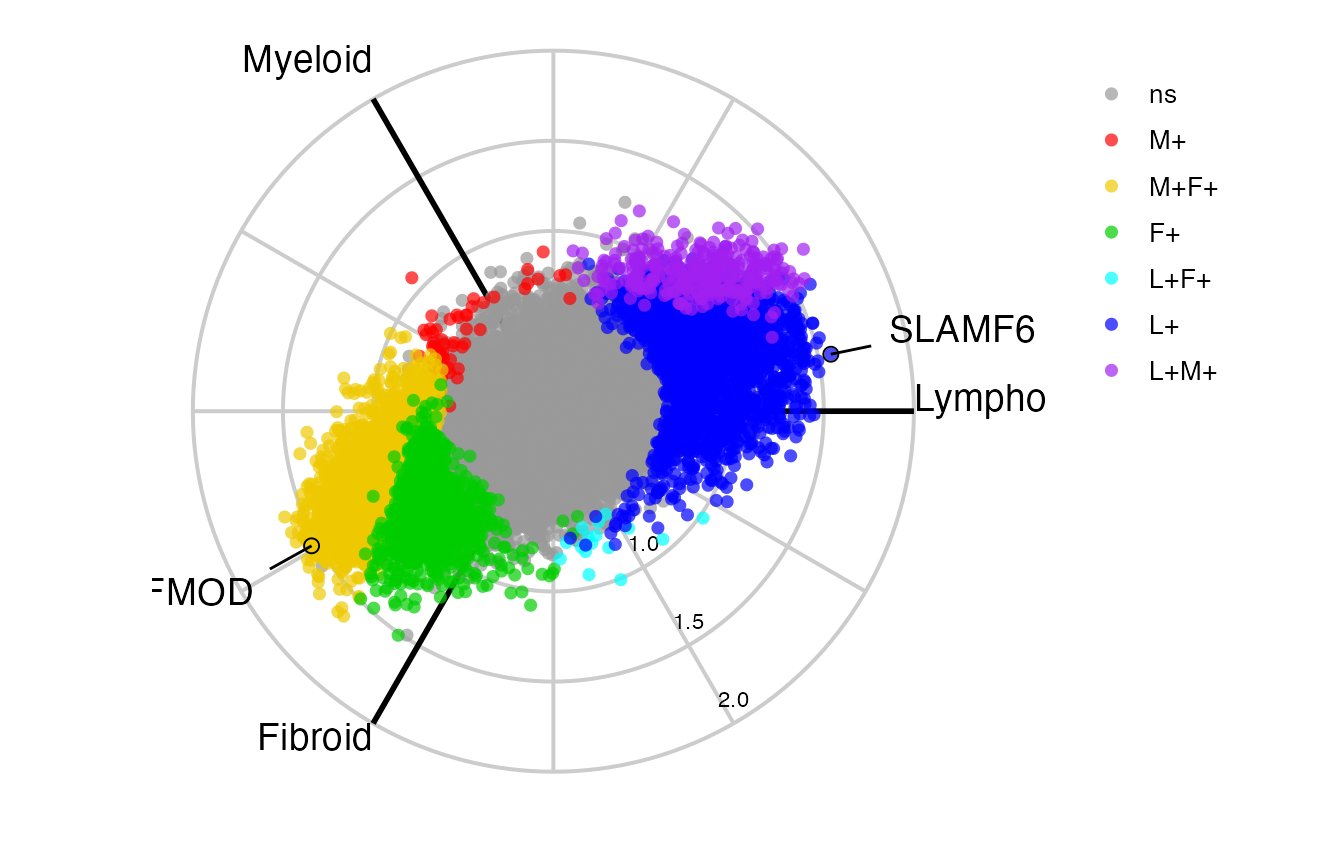
Boxplots
We can then interrogate any one specific variable as a boxplot, to investigate these differences. This is build using either ggplot2 or plotly so can easily be edited by the user to add features. Using plotly:
plot1 <- boxplot_trio(syn_polar,
value = "FAM92B",
text_size = 7,
test = "polar_padj",
levels_order = c("Lymphoid", "Myeloid", "Fibroid"),
box_colours = c("blue", "red", "green3"),
step_increase = 0.2,
plot_method='plotly')
plot2 <- boxplot_trio(syn_polar,
value = "SLAMF6",
text_size = 7,
test = "polar_multi_pvalue",
levels_order = c("Lymphoid", "Myeloid", "Fibroid"),
box_colours = c("blue", "red", "green3"),
plot_method='plotly')
plot3 <- boxplot_trio(syn_polar,
value = "PARP16",
text_size = 7,
stat_size=2.5,
test = "t.test",
levels_order = c("Myeloid", "Fibroid"),
box_colours = c("pink", "gold"),
plot_method='plotly')
plotly::subplot(plot1, plot2, plot3, titleY=TRUE, margin=0.05)Or using ggplot
plot1 <- boxplot_trio(syn_polar,
value = "FAM92B",
text_size = 7,
test = "polar_pvalue",
levels_order = c("Lymphoid", "Myeloid", "Fibroid"),
box_colours = c("blue", "red", "green3"),
step_increase = 0.1)
plot2 <- boxplot_trio(syn_polar,
value = "SLAMF6",
text_size = 7,
test = "polar_multi_pvalue",
levels_order = c("Lymphoid", "Myeloid", "Fibroid"),
box_colours = c("blue", "red", "green3"))
plot3 <- boxplot_trio(syn_polar,
value = "PARP16",
text_size = 7,
stat_size=2.5,
test = "t.test",
levels_order = c("Myeloid", "Fibroid"),
box_colours = c("pink", "gold"))
ggarrange(plot1, plot2, plot3, ncol=3)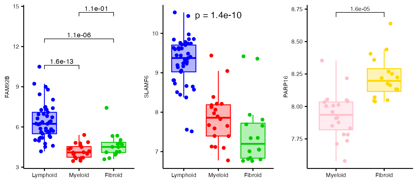
Three Dimensional Volcano Plots
The final thing we can look at is the 3D volcano plot which projects differential gene expression onto cylindrical coordinates.
Saving Plotly Plots
Static Images
There are a few ways to save plotly plots as static images. Firstly plotly offers a download button ( ) in the figure mode bar (appears top right). By default this saves images as png, however it is possible to convert to svg, jpeg or webp using:
Interactive HTML
The full plotly objects can be saved to HTML by converting them to widgets and saving with the htmlwidgets package:
htmlwidgets::saveWidget(as_widget(p), "volcano3D.html")Altering the Plots
Altering the Grid
By default volcano3D generates a grid using 12 spokes. If you wish to override any of these variables it is possible to pass in your own grid. This is also possible for the 3D radial plots where the z elements can be left as NULL.
By manually creating a grid object it is possible to change the tick
points on axes as well as the number of radial spokes (n_spokes). The
default ticks are calculated from r_vector and z_vector using the
pretty function. This can be overwritten by passing tick
points in r_axis_ticks and z_axis_ticks.
For example, we can decrease the number of radial spokes to 4, while altering the z axis ticks:
four_grid = polar_grid(r_vector=syn_polar@df[[1]]$r,
z_vector=syn_polar@df[[1]]$z,
r_axis_ticks = NULL,
axes_from_origin = FALSE,
z_axis_ticks = c(0, 8, 16, 32),
n_spokes = 4)We can inspect the grid using show_grid() which creates
both the polar and cylindrical coordinate system:
p <- show_grid(four_grid)
p$cylindricaland pass it into the plotting functions:
volcano3D(syn_polar,
grid = four_grid,
label_rows = c("SLAMF6", "PARP16", "ITM2C"),
label_size = 10)For example to extend the radial axis and increase the number of spokes in 2D we can apply:
new_grid = polar_grid(r_vector=NULL,
z_vector=syn_polar@df[[1]]$z,
r_axis_ticks = c(1, 2, 3),
z_axis_ticks = NULL,
n_spokes = 24)Altering the Annotations
To amend or reposition the plotly labels it is possible to use the editable parameter. This allows you to move annotation features (labels), change text including legends and titles. Click on a feature to change it:
p = radial_plotly(polar = syn_polar,
label_rows = c("SLAMF6", "PARP16", "ITM2C"))
p %>% config(editable = TRUE)Example 2. Synovial Modular Data
We can collapse this example into a modular analysis using a list of gene sets. In this example we have used the blood transcript modules curated by Li et. al. in ‘Li, S., Rouphael, N., Duraisingham, S., Romero-Steiner, S., Presnell, S., Davis, C., … & Kasturi, S. (2014). Molecular signatures of antibody responses derived from a systems biology study of five human vaccines. Nature immunology, 15(2), 195.’. The pvalues were generated using QuSAGE methodology.
Creating polar coordinates
The modular analysis can be loaded through Li_pvalues:
data(Li_pvalues)
syn_mod_polar <- polar_coords(outcome = syn_metadata$Pathotype,
data = t(syn_mod))Radial Plots
radial_plotly(polar = syn_mod_polar,
axes_from_origin = FALSE,
label_rows = c("M156.0", "M37.2"))Or a ggplot static image using radial_ggplot:
radial_ggplot(polar = syn_mod_polar,
label_rows = c("M156.0", "M37.2"),
marker_size = 2.7,
label_size = 5,
axis_lab_size = 3,
axis_title_size = 5,
legend_size = 10) 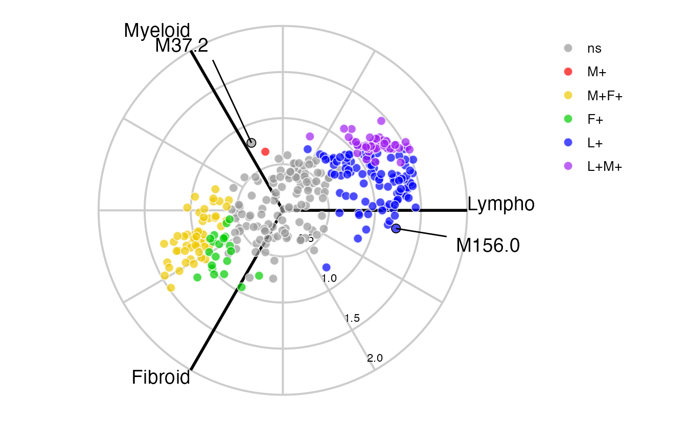
Boxplots
We can then interrogate specific modules with boxplot_trio:
plot1 <- boxplot_trio(syn_mod_polar,
value = "M156.0",
test = "wilcox.test",
levels_order = c("Lymphoid", "Myeloid", "Fibroid"),
box_colours = c("blue", "red", "green3"))
plot2 <- boxplot_trio(syn_mod_polar,
value = "M37.2",
test = "wilcox.test",
levels_order = c("Lymphoid", "Myeloid", "Fibroid"),
box_colours = c("blue", "red", "green3"))
ggpubr::ggarrange(plot1, plot2)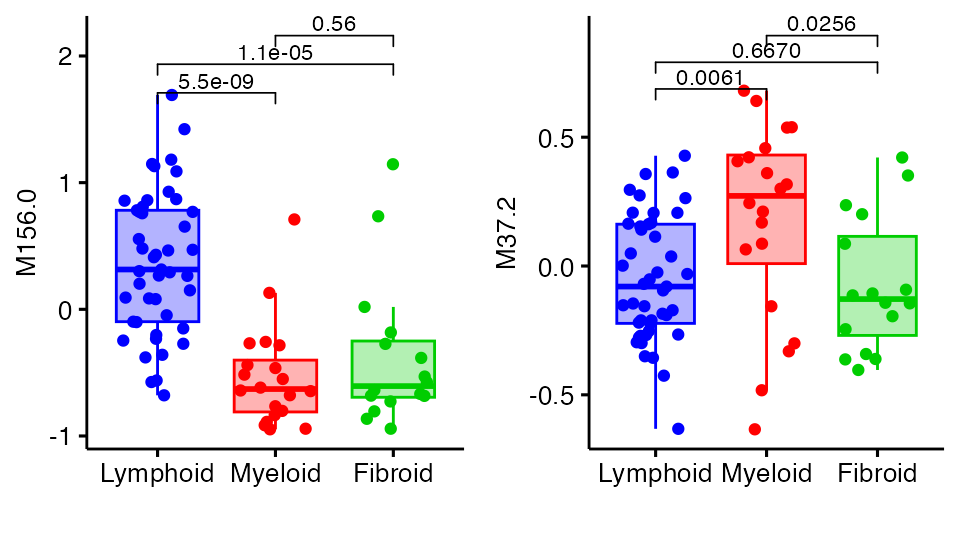
Citation
If you use this package please cite as:
citation("volcano3D")##
## To cite package 'volcano3D' in publications use:
##
## Goldmann K, Lewis M (2020). _volcano3D: 3D Volcano Plots and Polar
## Plots for Three-Class Data_.
## https://katrionagoldmann.github.io/volcano3D/index.html,
## https://github.com/KatrionaGoldmann/volcano3D.
##
## A BibTeX entry for LaTeX users is
##
## @Manual{,
## title = {volcano3D: 3D Volcano Plots and Polar Plots for Three-Class Data},
## author = {Katriona Goldmann and Myles Lewis},
## year = {2020},
## note = {https://katrionagoldmann.github.io/volcano3D/index.html, https://github.com/KatrionaGoldmann/volcano3D},
## }or using:
Lewis, Myles J., et al. ‘Molecular portraits of early rheumatoid arthritis identify clinical and treatment response phenotypes.’ Cell reports 28.9 (2019): 2455-2470.